Over the last year, I’ve made around 45,263 design decisions. Not all of them were “correct” and while many weren’t “wrong” per se, they may not have been the best choice. I’ve come to realize there is a big difference between a “design mistake” and a “design regret”. The former is something that is “wrong” and you really try to fix or come to terms with not ever fixing, and the latter is more nebulous and painful (where something could just be better). I’m writing a full post about it for the living room (where a couple of huge design regrets live) but today’s post also contains a very fixable design regret. The fireplace in the main bedroom was designed and built to mimic the original one in the living room. We installed the same brick and then painted it.
The Inspiration

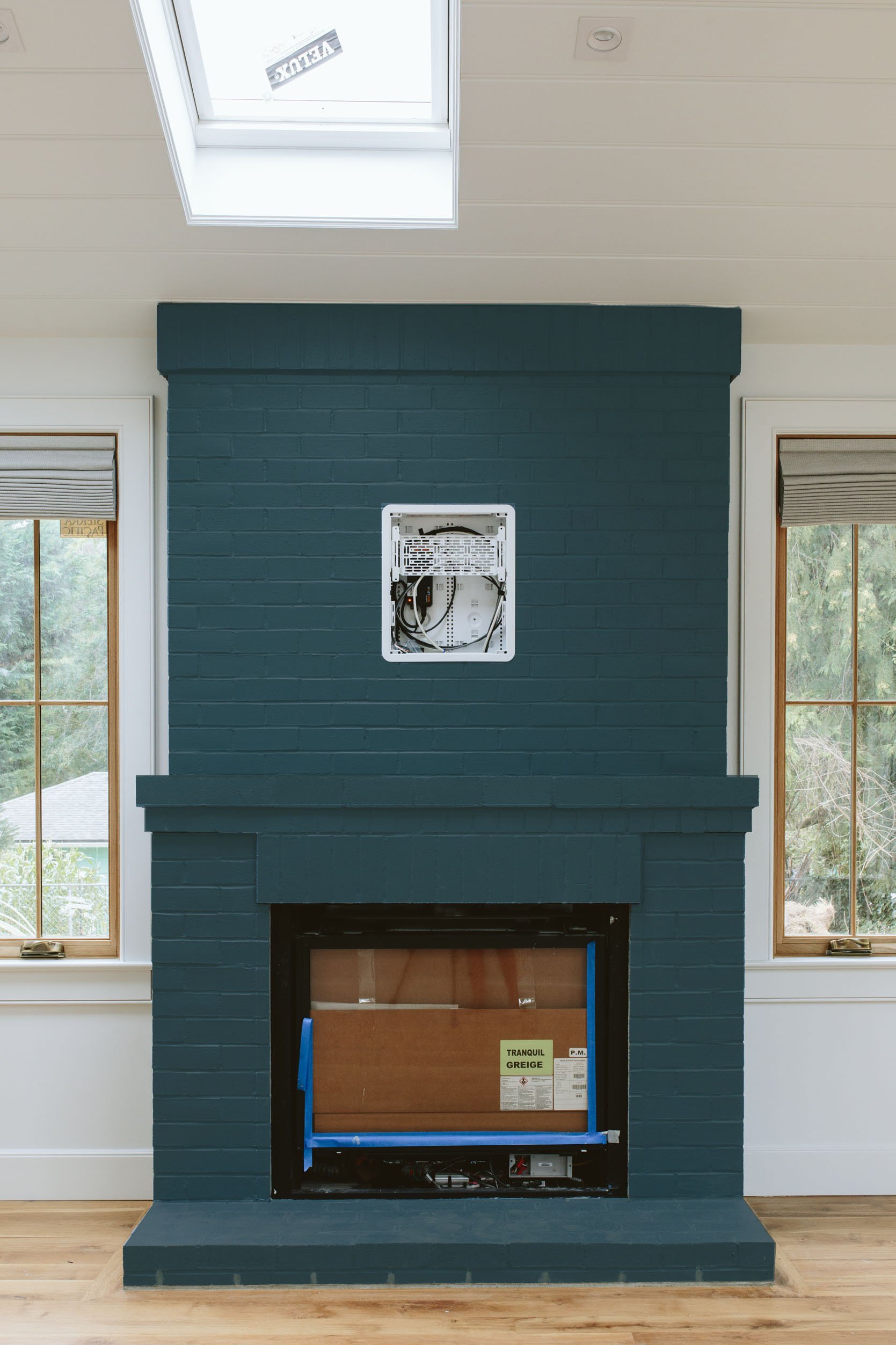
Max Humphrey designed my friend’s beach house living room with a dark-painted fireplace and we loved it. Sometimes it looks dark blue, sometimes closer to charcoal but it’s just so pretty. And it’s my personal and strong opinion that TVs and gas fireplaces (the black boxes) look better on darker fireplaces. So before we left for all of July we attempted to choose the right color that gave it this vibe.
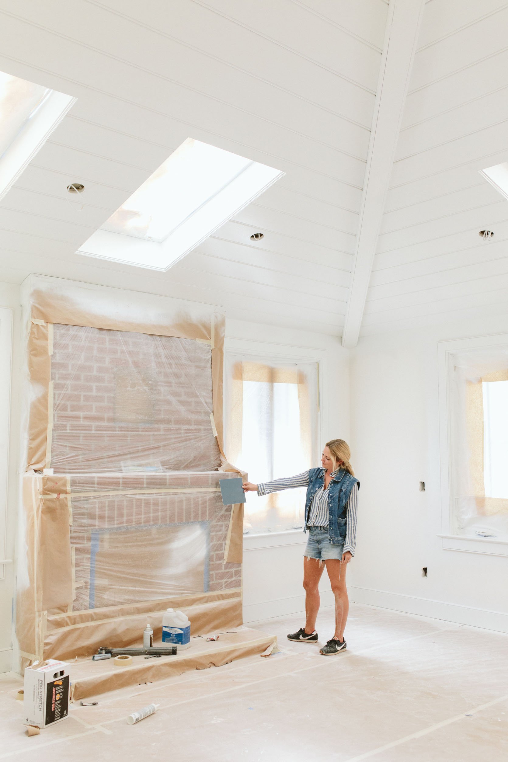
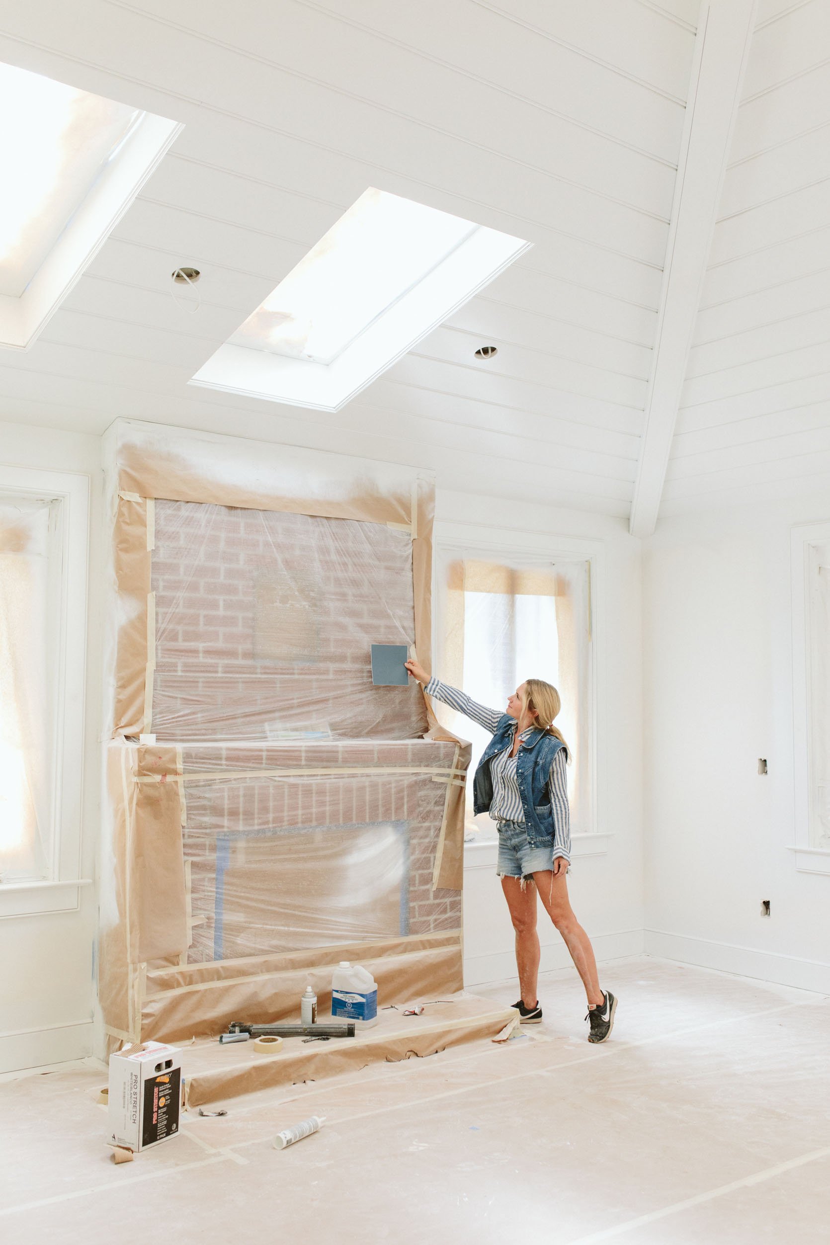
We chose Smoky Blue by Sherwin-Williams, felt confident, then went on our trip. Done!
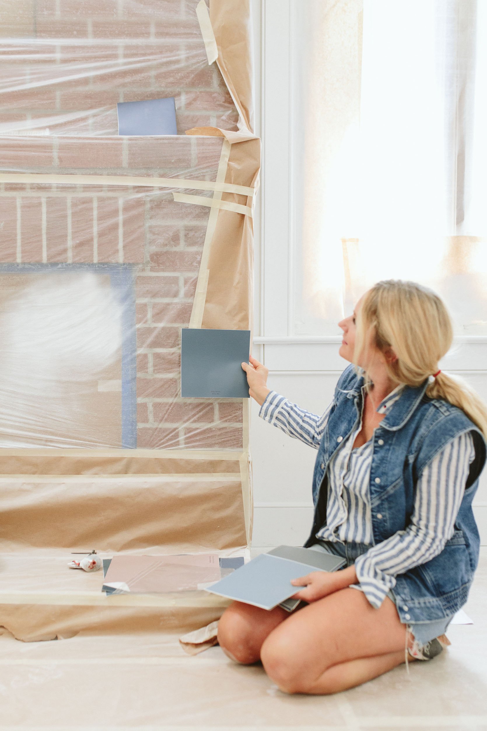
Seeing these photos of me holding up a swatch even now I want to shout, “Hey past Emily! That color is much lighter than the inspiration shot!”. But that’s what that lady chose and now this lady has to live with it (or change).
The Current Paint Color: Smoky Blue by Sherwin-Williams
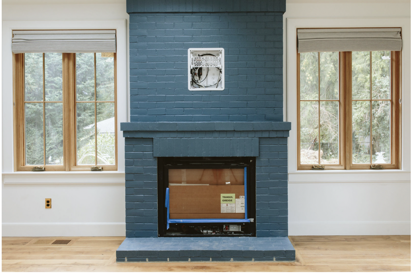
So we get back and turns out it’s a lot lighter than I wanted. We were all like, “Wait, that isn’t Smoky Blue. Then, sure enough, we held up the swatch and it matched perfectly. HAHAHA. It’s SUCH a good color (so good that we decided to put it on our stairs, which we did and LOVE) but it is lighter than we had wanted in here. Then we were told that the masons weren’t done with the fireplace – that the bottom wasn’t grouted (as you can see) and there were like 4-5 missing bricks on the side, so the painters (or us) would have had to paint more anyway.
This is not the only paint color I was “surprised” by when I got back and I made the decision that I would live with almost all of them – to ensure that whatever we do choose to do that we take our time and do it right (and btw, we have so much leftover white base paint that we can take it in and just have it tinted so we aren’t ordering new paint or wasting the paint we have). And of course the longer we live with it the more we like it – it’s just a really really good blue…

Fireplace Other Paint Colors I’m Thinking About…

So I asked my team to photoshop on all some other colors to see and boy is it helpful. The left is Night Watch by Sherwin-Williams and the right is Cascades by Sherwin-Williams. I definitely like how the one on the right still has some blue undertones. We didn’t want a pure black, just an almost black.


But just in case, I wanted to see what it would look like if we did a lighter color like Pearl Gray, and as predicted it just doesn’t look as good. Not only does it not ground that wall enough, but I have found that gas fireplaces and TV just pop out too much on a light fireplace.
Now we aren’t deciding on the new color today because I’m not secure on the design of this room yet. Here is what is up in the air:
- We’ll get the new bed in a few weeks, and it is a tone but having it be here in person will help a lot.
- We are using our old living room rug, which I still love but is very stained. I’m going to try to get it cleaned and if it’s still kinda bad (which is very possible) then I’m thinking about having it cut down into smaller rugs to layer over the kids’ wall-to-wall carpet (after being cleaned). But if we get a new rug in here it will definitely help dictate the fireplace color.
- I’m thinking about painting the walls in here a light tone – just something to warm them up (I miss the wood trim around the windows and ceiling A LOT, TBH).
- Art, accessories, another layer of curtains? I’m loving how simple this room is TBH, but I can admit that it’s also kinda boring right now.
- I almost always like to choose paint colors last, but as you know when you are renovating they want them before you move in as they usually paint before finish electrical and plumbing fixtures go in (understandably) so thus the regrets happen. For us, we were choosing them against tarped-up spaces and artificial lights (and even left a few rooms only primed because we felt so insecure). So to fix or figure out how to live with these regrets I’m taking more time and making sure that the other elements are dialed in before finalizing the paint color. A HUGE thanks to our partner on this Sherwin-Williams for understanding the challenges of renovations and being patient with me.
So that’s where we are currently at. Wish us luck! xx
If you are curious, here are the rest of the room sources:
Wood flooring: Oregon White Oak by Zena Flooring
Windows: White oak, Aspen Casement by Sierra Pacific Windows
Fireplace: Slimline 7X with Tranquil Greige Refractory Brick by Heat & Glo
Current Fireplace Color: Smoky Blue by Sherwin-Williams
Skylights: Skylights with Room Darkening Shades by Velux Skylight
*Photos by Kaitlin Green



Curious how Arciform partnership is going.
Wouldn’t their collaboration be pretty much over now that construction is complete?
If light fixtures still need to be installed, I would not consider construction to be complete.
Whether or not the lighting fixtures have been installed, their locations were cemented long ago in the planning stages, with Arciform. In my experience, the architect’s job is finished well before move-in.
It depends. Sometimes architects are hired to do “Construction Administration” which may include performing a punchlist once everything is complete. When someone performs a punchlist, they walk around the house and inspect the quality, missing items, things that need tweaking, fixing, touching up, etc. Then they hand off the list to the contractor who needs to address the items before the job is considered complete and even sometimes before they can receive final payment. Depends on the contract.
Yes but the creative collaboration is largely over.
As an architect myself, we usually are involved with construction all the way through punch list and sometimes even with furniture placement and interior design on some projects (we also provide interior services). A lot of punch list items are not just “fix this paint smudge” but also small design issues like how to terminate a piece of trim that hits a cabinet in a weird spot or how to resolve a weird shadow from a light fixture. Those are still design issues, even if they are at a much smaller scale, and are usually where the level of quality of a really good architect shines through.
Such a good point on how the gas insert stands out with a light color. I like the darkest option personally, it’s more modern and “adult” (sophisticated?) and less “kid’s playroom,” which is how most lighter/closer to primary blue walls/furniture read to me. But to each their own!! I love coming to this blog for surprises like blue fireplaces. Whatever you choose will be fantastic and I know you’ll style it out to look incredible! Thank you for taking us on this journey with you 🙂
Me too. The grey one is much nicer. The other one will look very blue/green i.r.l.
Perhaps the problem is that the upper part of the chimney makes it all a bit heavy and domineering in the room? I think if you just had the fireplace itself painted dark — even the pretty current blue! — it would look, but painted the upper part the same white as the walls, it could look lovely!
I never would have thought of this, but I think you’re right!
Depending on the wall color and other hues in the room, Georgina’s suggestion could be something to try. The different colors on the chimney and fireplace box is a more traditional/less modern look that I’d guess Emily wants to move away from, but depending on the design elements of the entire room, could be appropriate. I’m wondering if a mid-tone is being considered for the walls, because less contrast between the walls and fireplace would create more mood and also soft calm in this light-filled bedroom. Two shades of smokey blue (not necessarily the exact same paint color) could be really gorgeous and restful.
I agree with this. The whole thing feels so heavy – especially compared to the dainty-looking muntins. The fireplace completely dominates that wall and dwarfs the adjacent windows. Painting the top, or even the whole thing the same color as the wall will make it blend in with the wall. Or maybe a simple antique farmhouse-looking marble surround will work better instead of the whole brick structure?
I agree, maybe a plaster treatment (or just drywall, I guess) on the chimney would make a color on the bottom less heavy.
I think the tv may then stick out very much…
The big solid block of color is a lot, no matter which one. Weirdly, I like the plain brick better. Ofc you will break it all up with decor and such, so it’ll be fine in the end.
I agree, the brick color would have been my first choice. To me it does not make sense to first make a new brick chimney and then to paint it.
I love the inspiration photo. I think Cascades is going to have too much green undertones. And night watch is too dark. The inspiration photo looks like a true charcoal w/ blue undertones. What about something like SW Gray’s Harbor?
I likethe Cascades colour, since it has a bluish-green hue.
Seems like it would effortlessly speak to your natural choices we seen over the years.
It sort of says “Emily” to me.🤗
*we’ve
I think the issue is that the inspiration image has all the wood, whereas this room is currently a stark white, with only a hint of wood around the windows to break it up. I’m not saying you need to go all wood here to make that blue work (although if you’re willing to reopen the option of a stained wood paneled ceiling…) . More that the rest of what you have in the room, esp. if you have some warm tones, will help even the blue you currently have look better.
I agree with Annie and I’d wait to paint it until the major decorations are added, the rug, the bed, and the wall color will make a huge difference and I think this color can absolutely work beautifully. I also appreciate tying together the architectural elements of the entire home which makes it look more like this fireplace was always there historically. This Smoky color also speaks to the original Shaker style inspiration. I say wait and paint it later if it’s still an issue but keep it until everything else comes into place and see how it all works together.
Such a great insight Annie So much wood in the inspiration and of course the stunning ocean view… so the dark block of fireplace was a 3rd strong design element… I agree to do the rest of the room first and live with it for a while before you make any changes.
Go dark! 🙂 We inherited a blue/green fireplace and painted it black when we moved into our house 10 years ago. Our flooring, furniture, and decor have changed over the last decade, but the fireplace has remained and still feels fresh and timeless, no matter what art or decor we put in the room or on the mantle. The black also serves as a great backdrop for Christmas garland and decor and allows us to change that decor color without coordinating with the background color.
Thanks for sharing what a process it is to getting the 100’s of things your eye sees in a room. It makes sense numbers wise that to get the degree of beautiful that you have been getting that it requires serious thought/effort to get that higher percentage of decisions nailed. From what I have seen so far you are doing it, LOVE your office floor, windows and ceilings, LOVE your kitchen millwork detail and that walk in pantry with modern cladding, who wouldn’t love all the parts of your mud room from practically to utility beauty. I am seeing all the background decisions to make those sing.
Get some sustenance breaks and real time you time, (Brian on extra cooking and kids) at this vital stage for the home run. You can do it, we are all behind you cheering you on, plus waking up excited to see if any new farmhouse posts so THANKYOU…..for sharing EVERYTHING like you do. Including Max, what a great inspiration to go off.
Gabrielle
Cascades! We’re about to use it high-gloss for our bar area because it seems like the perfect weirdly-neutral almost-black with lively green/blue undertones. I think those undertones will help balance the big presence of the brick area.
Trying to upload a rendering of the bar but it’s not working 😔
Got it
That said, our goal was a green/black, not a blue/black.
I get why you’d want a darker color, but I really like the color it is! It feels unexpected and charming.
I think leave it! It’s a tiny step towards more color without going crazy. Plus, could be a fun challenge to incorporate with the rest of the room and it’s just a bit different than what I’ve seen anywhere else without being crazy!
But if you really want to paint it… I’d vote for night watch. Seems like a really soothing dark color.
LOVE the Smokey Blue color on your stairs when it pops up in Insta Stories, so this was a happy mistake since it resulted in those stairs!
Love the Nightwatch. But also the cascade. But I guess I’m not really much of a help. Definitely depends on the rest of your furnishings. What color would you paint the walls if you did the Nightwatch and or the cascade? We I have an old house with a gas fireplace in our bedroom. It’s a smaller room not as grand as yours. Trying to figure out the same thing. I’ve been looking to paint the fireplace forever. Thank you and love you Design!
I’m leaning toward Nightwatch, loving the deep tone of this, especially with the backdrop of your Oregon trees. The Cascades option still feels really turquoise to me and maybe not that soothing/seamless feeling you’re after?
I got sidetracked with all the rug talk-I’d love to gift a vintage or new Moroccan rug for your farmhouse (this room or any) as I found my love for rugs via Emily ten years ago on this very blog!! I’ll email the team.
Nicole
Bente vintage
Whoo!
That’s gratitude.
Sweee-eet!
Of the paint options I think the darkest one will get you closest to your inspo picture but if you are missing the wood window frames and ceiling- it sounds to me like warmth, depth and natural character are what you are craving. I would sabdblast that brick and keep it natural 🙂
What about something lighter, more neutral to or sandy to complement the natural wood trim of your windows?
Love to see the progress! I think any of the colors (except the pearl grey) could work based on what you do with rug and other styling. I will say, the one thing that stuck out to me were the roman blinds. My eye wanted them to either match the wall paint, or match the fireplace. I think, personally, matching the wall paint would make the most sense. White blinds would allow the beautiful wood to “pop” more, and let the fireplace and your art, etc. be the showstoppers. Just my opinion. All in all, I love how it is coming together! So exciting!
p.s. very much looking forward to your design mistakes versus regrets post. I think we can all relate only too well!
Great eye! I had to scroll back up and look at the blinds color!
Also agree regarding window shades. Gray shades just not doing it for me. White to match walls would be beautiful. House looks beautiful
I’d leave it alone until you get the room fully furnished–the color looks fine to me.
If you’re open to color suggestions (outside of what you’re already considering), I HIGHLY recommend “Cyberspace” by Sherwin Williams for a dark, almost black with clearly blue undertones. We used it on our family room fireplace wall, and it’s the absolute perfect moody shade…we’re now considering painting our kitchen cabinets the same color! Looking at the inspo shot, it actually may be the same color (if not, it’s extremely similar).
I painted a whole room (ceiling included) cyberspace and it is FANTASTIC. In all light. Just the right dark vibe but somehow still warm and inviting.
I was just coming here to say the same thing! Just painted exterior with Cyberspace and it brings that darker gray/black shade with some blue undertones that I think would be perfect for this fireplace!
I would love to see a pic of your exterior. We are going dark on our 80’s postmodern but it’s so tricky to get the right dark. I want blue undertones and definitely not grey.
Dena,
I used BM Soot on our 4 story cedar shake house. It has more dark blue undertones (that especially come out in the sun) than we expected, but have really come to love. FYI – we live in Portland and love the black color against all the green trees here!
The inspiration fireplace was set in a beautiful but very modern home. To me, a big moody-black-ish fireplace would be out of place in your farmhouse, especially next to the dainty white-trimmed windows. I agree with others that if you’re going to paint it, a darker neutral makes sense.
I was all set to vote for the current color until I scrolled down and saw Night Watch and now I am loving that. Thanks for sharing your regrets/changes because this is so relatable and helps so much to know it happens to everyone. Even the pros! I don’t like the color we picked for trim and made myself live with it for a year and still want to paint it a different color. Sometimes you just know it isn’t working and it just needs to change.
I like Night Watch best. Have you considered adding a wood mantel piece over the brick to bring some of that warmth in – as in the inspiration image?
It appears that you have to use SW colors bcuz they’re the sponsor, but, what about color matching Railings from F&B? That seems to be a very dark blue that can appear black?? Anyway just a thought 😊. Love all of your designs, can’t wait for the final reveal 😁!!!
I have a MCM fixer upper that we’ve have slooooowly been re-doing(95 yr old with demetia lived here before…bless her heart)for the past 1 1/2 yrs. i must say it gives me peace when you mention the design errors you have made along the way. i have alot of FEAR of making mistakes and it stops me and makes the process take 3x as long. When we see all of the gorgeous homes and redesign from professionals it seems easy until you are in the trenches. THANK you for your full disclosure and honesty!
Agreed! We’ve been working on our MCM fixer bungalow for over ten months. (Almost a year! Yikes! That is terrifying to say aloud because the progress has been slower than intended!) I overthink every decision because (like normal people) taking on a major renovation is a big financial investment for us. I won’t have the luxury of many re-dos for quite awhile after we’re done so I am trying to get it JUST RIGHT. Which is so difficult in the real world when you have to make decisions long before you have all the materials, etc. It’s comforting I am not alone in this!
I think it looks lovely as is!! Since you’re already decision-fatigued I would vote to live with it for a year once the room is fully furnished, then make any updates. I think you’ll get a better sense of what you want long term!
I like the night watch.. but know you will always be happy w blue. I think the darker color competes less w window views tooI Just think the darker is more neutral . I usually end up mixing my own colors, why not try mixing cascade and night watch? I’d use the cascade and add a bit ( measure proportions) of night at a time. ..and go ahead and paint some on. I think the bed will be less critical as it is on a different plane, plus w bedding, pillows ,blendable.
My vote is Night Watch. The greenish blue hues look MCM.
I love the darker color in the fireplace, rather than something that is obviously blue like what you have now. Blue is kind of Kindergarten classroom rather than suggesting a sophisticated space.
I’d vote for either Night Watch or Cascades. I love both and we actually bought Cascades last year to paint our fireplace similarly, but we chickened out when I saw how greenish it looked in our room and we painted it over.
If your room is West facing, the extra light will make Cascades look green – which might not match your overall decor plan. In contrast to Cascades, Night Watch is much more neutral.
I really like the Smoky Blue! I find Night Watch to be too dark & heavy looking & Cascades to be too green to look like signature Emily.
Hi! I painted my last bedroom SW Cascades. I loved it but the room had a very old deep whisky toned wood trim/ floors. To me, in that room the color looked more green than blue the majority of the time. Best color ever for old library vibes. With how much blue you have going on, it might look too green for you. Or maybe not!
But with a frame TV you do not need to put it on a dark background to disguise it, and surely there are lighter coloured fireplace insert out there?! I like the light colored one…
I would ask the team to photoshop the TV and a few decor to make a more informed decision!
I feel like in the inspiration shot, the color of the fireplace is pulling in some of those extra dark charcoal tones in the mountains outside. It feels like that color belongs there. I’m finding that the Nightwatch is doing that with the evergreens outside the window. It feels like the color belongs there.
Isn’t the Frame TV supposed to allow you *not* to have the black box. Isn’t that point? Of course you’d still have the black fireplace to contend with but I’m with everyone else who says the reason the darker fireplaces work in the inspo photos is because of other elements in the room (wood etc.). This room is white. Paint the fireplace white or off white and add cute tiling or something around the fireplace so that black box feels less aggressive.
The skylight placement relative to the fireplace feels odd. Actually, skylights in bedrooms feel like an odd choice, where you normally want a cozy and dark feeling for sleeping (or watching tv in bed). Draperies in a mid-blue close to the Smoky Blue could really help in unifying the various elements, and it is such a gorgeous color. But sorry to say that the skylights will always feel off, in my view.
It’s the same issue as in the kitchen where there are three skylights not centered over five windows. It’s off balance to my eye and would bother me to no end. My brain likes symmetry and when something is off like the skylight over the fireplace, my eye is constantly drawn to it in not a good way. It’s just the way I’m wired. Things most people wouldn’t even notice, jump out at me. Like the narrow wall between the entry way and the living where there is a sconce, outlet and light switch. The outlet and light switch are aligned 2-3 inches from the trim but the sconce is centered on the 8-10 inch wall. Since the wall is so narrow, why not center all three for visual harmony? I have things like this that annoy me in my house. Difference is I didn’t build/remodel my house and have full control over them. I don’t understand these types of design issues when you do.
We have a skylight right over our bed (for 20 years now) because my outdoorsy husband loves sleeping under the stars. It really is quite lovely, and you get used to the extra light when it actually shows.
I’m seeing a color more green, along the line of Cascades because of the evergreen trees outside. In your isnpo pic the fireplace picks up colors from the ocean and rock, so should your color pick up your exterior to get the same harmony. Having said that, I agree with those who said wait.
Night watch is beautiful
The current blue is lovely, but I agree it’s not really close enough to feel quite like the original. I think I’m seeing a difference in the paint texture from your inspiration shot, the way it picks up the light in a more powdery way. The current look is more sharply saturated in a way that says “freshly painted,” not as softly glowy and milky as Max’s charcoal.
I vote for night watch or another darker color. When you paint a textured surface, the light bounces off the irregularities and make it read lighter. I also think a darker muddier color will read more sophisticated. Something about a fireplace like this just isn’t supposed to be BLUE blue in my mind. I do think it would be nice to paint the trim a contrasting color and the wall something less stark (even if the color still reads white, it could be warmer and have more depth.)
I found the color jarring too initially, but now I love that it’s an unexpected choice. The modernity/freshness of the color contrasts perfectly with the traditional style of the fireplace. I think once the room is complete it will be gorgeous and fresh.
Just an observation: the bricks in the inspiration shot are way more rustic than yours, with broken and rounded edges in places. The grouting seems to be deeper set so there is more of a dark shadow between the bricks. And the paint seems to be almost chalky. I think this the difference between yours and Max’s and I think all the shadows in Max’s is what gives it a darker smoky feel. From the printed image of yours, the grout lines are uniform and close in depth to the brick face. If it was mine, I think I would try a dark wax or wash over it all that would settle in the grout and cracks and give an overall darker feel while still not changing the original color you love so much.
How about cladding the chimney on wood – same tone as the windows? It is more expensive, obviously, but closer to the inspiration, and will turn it into more of a feature. I would do plain wide horizontal slats to match the windows. I would then do the bottom in Night Cascades (or leave the Smoky Blue). I think it also depends on what kind of art you’re planning to put there, because right now, it’s all kind of background, it doesn’t draw they eye (which is why, I think, some people say it looks heavy).
It’s good as is. Adding decor, curtains/shades, etc with a touch of color will balance everything out and will be consistent with the color scheme of the house. If you want this to blend in with a beige or white room or very neutral room, then go dark with something closer to charcoal. However it won’t look as unique. If you weren’t pressed to completely finish the home it would be great to see a more minimalistic space before you add all the decorations. I think it’s okay to decorate a room and then change your mind as you live and get exposure to new things. It doesn’t have to be a mistake or a regret. Things can work today, but as time passes you are allowed to make updates
Love love love the color it is now!
Hi! My favorite blue almost black color is Behr’s ink black. It’s all over my house and it’s so so so pretty. 🙂 Good luck!
Paint appearing different once it’s up is a constant frustration! No matter how many samples I paint on different walls, it always appears differently. My biggest suggestion is something I did in my own home after we tore down a remodeled fireplace and found the original brick one underneath. No matter which color you decide, I would go with a lime wash paint. Lime paint feels like it belongs on brick because it has the natural feel that brick does. Then there’s a subtle variation which adds depth back to the fireplace! It will make your dark color appear darker because of the chalkiness! Best of luck in these final decisions. 🙂
I went a different route. I had an old red brick fireplace in living room when I moved in. Rather than paint it, I coverd it with Mexican Beach pebbles. I did the work myself , grouted and sealed it. I chose I light gray but there was a gorgeous almost black that was a close second. They come in different sizes and in hindsight I wish I’d chosen slightly larger but they are gorgeous and natural looking and flat enough I didn’t have to make changes to anything else like trim.
The color looks intentional, at first I thought it was chosen as a nod to the blue bathroom tiles, but upon further reflection there is a bold smoky blue thread running through the house intentionally placed in permanent architectural points such as the primary bath, fireplace, the pantry, the kitchen, the stairs, and the sunroom flooring. I would step back and zoom out and you might find that you have this blue beautifully woven through the main floor rooms in different textures, on different surfaces, and in different tones making everything look cohesive.
Doubt is a huge obstacle we all face, and it’s a tough one. But you got this!
This blue is lovely and if mistakenly putting it on the fireplace inspired the choice for the stairs, then it wasn’t a mistake at all, just part of a larger process. In terms of repainting, I’d rather get the stairs right and the fireplace wrong than the reverse!