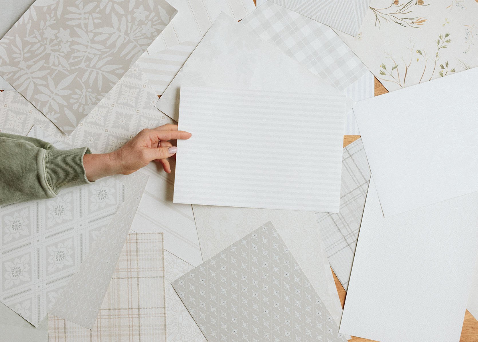
When people ask me “What wallpaper did you end up choosing for the ______ room,” I find myself responding with a classic Emily caveat, “You are going to be underwhelmed… lower your expectations…” Then I show them the sample and sure enough, they are underwhelmed and often confused, like “why that one?”. Here’s the thing (for me) – I LOVE pattern, texture, and color but if you have all of that in a room it will have a lot of contrast which is fine for people who like a more exciting and visually stimulating home. But (and I feel like a broken record) I want a calm, quiet, warm home. This is virtually impossible with my job (so much production here), kids, pups, and years of hoarding/collecting wonderful things that I want to play with. So for me, the solution is to go big at times (on the floor, like our sunroom) but keep what is at eye level more calm/tonal/quiet. This is the first time I’m doing this strategy so I’m not saying that this it’s foolproof, I’m just trying it to ensure that on a messy Thursday afternoon, after a long week, I don’t look around and see utter chaos and want to escape my own home in search of calm (which used to be the case in LA and why I loved the neutrality of mountain house so much). So if I like “stuff” (which I do) and I like color (which I do) then it’s my current theory that I need to go quieter OR tonal/monochromatic (which is quiet in its own way) on the prominent walls in order for me to be able to still explore with color, pattern and all my vintage “stuff”. So that leads me to gravitate towards and use what you could say are very, very neutral wallpapers.
I also want to quickly say that I did indeed also choose at least two busier/more colorful wallpapers in the house already (Elliot’s room and the guest bath which hasn’t been installed yet). And I have two left to choose and I’m not sure what way I’ll go. That means we’ll have a total of six papers in the house, btw 🙂 See? I like pattern and texture 🙂
The Entry Wallpaper
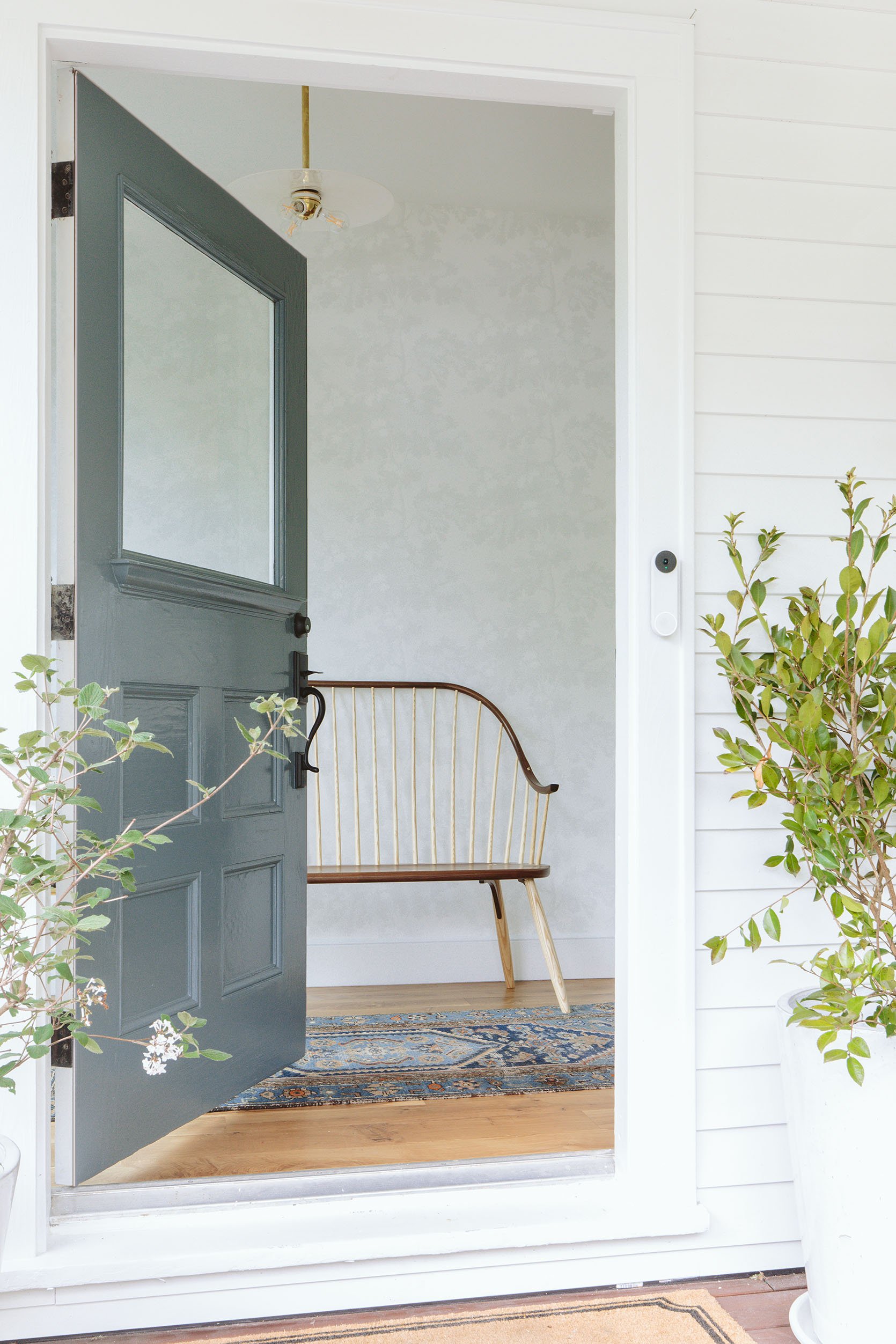
Y’all. It’s so pretty. It’s the Scalamandre Raphael Sandberg wallpaper in white. This wallpaper for this room was extremely hard to choose because of the following:
- It’s the literal first impression of the house so I wanted it to set a happy, calm tone.
- The window to the left is the star, so whatever pattern we choose needs to complement it, and while I did consider some more linear patterns, something more organic would look better with the window’s lines.
- You see this entry from the living room, dining nook, etc, so has to look good with everything.
- At the same time, this is an enclosed space and could be an opportunity to do something more fun. I didn’t want to just paint.
After looking at more bold florals for months and months and months, some of them I got tired of looking at if I’m being honest. This might be due to again, the fact that I stare at design on the internet all day and I see these patterns repeat (which is going to happen if they are good!), but slowly I began eliminating the ones that I felt that I would tire of or were just wrong for a variety of reasons. And what was left were all the soft neutrals.

Bench | Pendant Source | Rug (vintage)
I really really really love it. After living with it for two weeks I’m even happier. I had a literal nightmare about it being underwhelming, but when I woke up that morning and came to look at it again I was like, “Nope, this means I get to have more powerful art”.
That light fixture is vintage from the Antiques and Vintage part of Rejuvenation. I LOVE that they still carry vintage on their site since as we all know the profit margin isn’t necessarily high for this compared to manufacturing new. I love that three-way bulb fitter in this as well. Thank you, Jordan 🙂
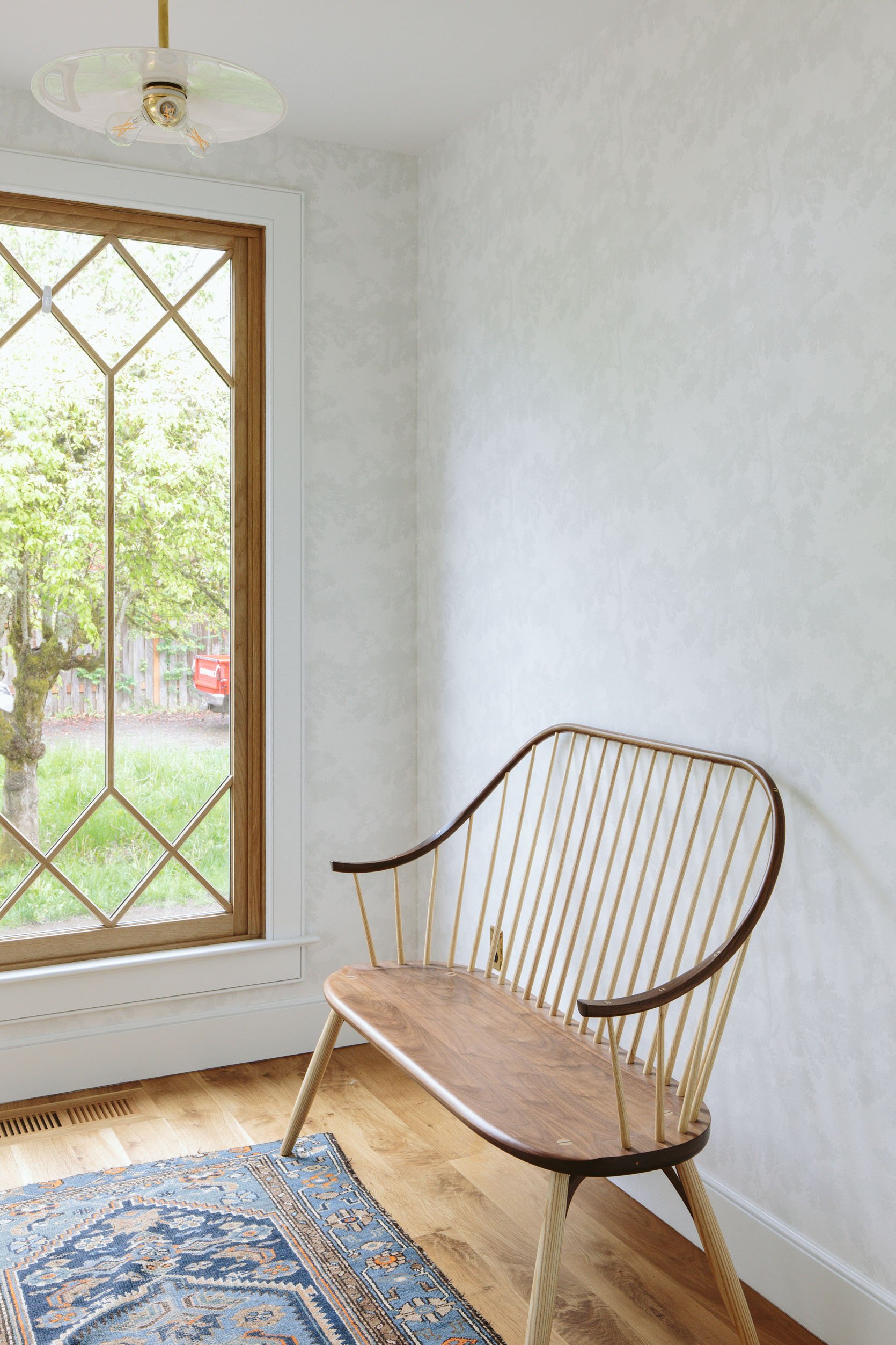
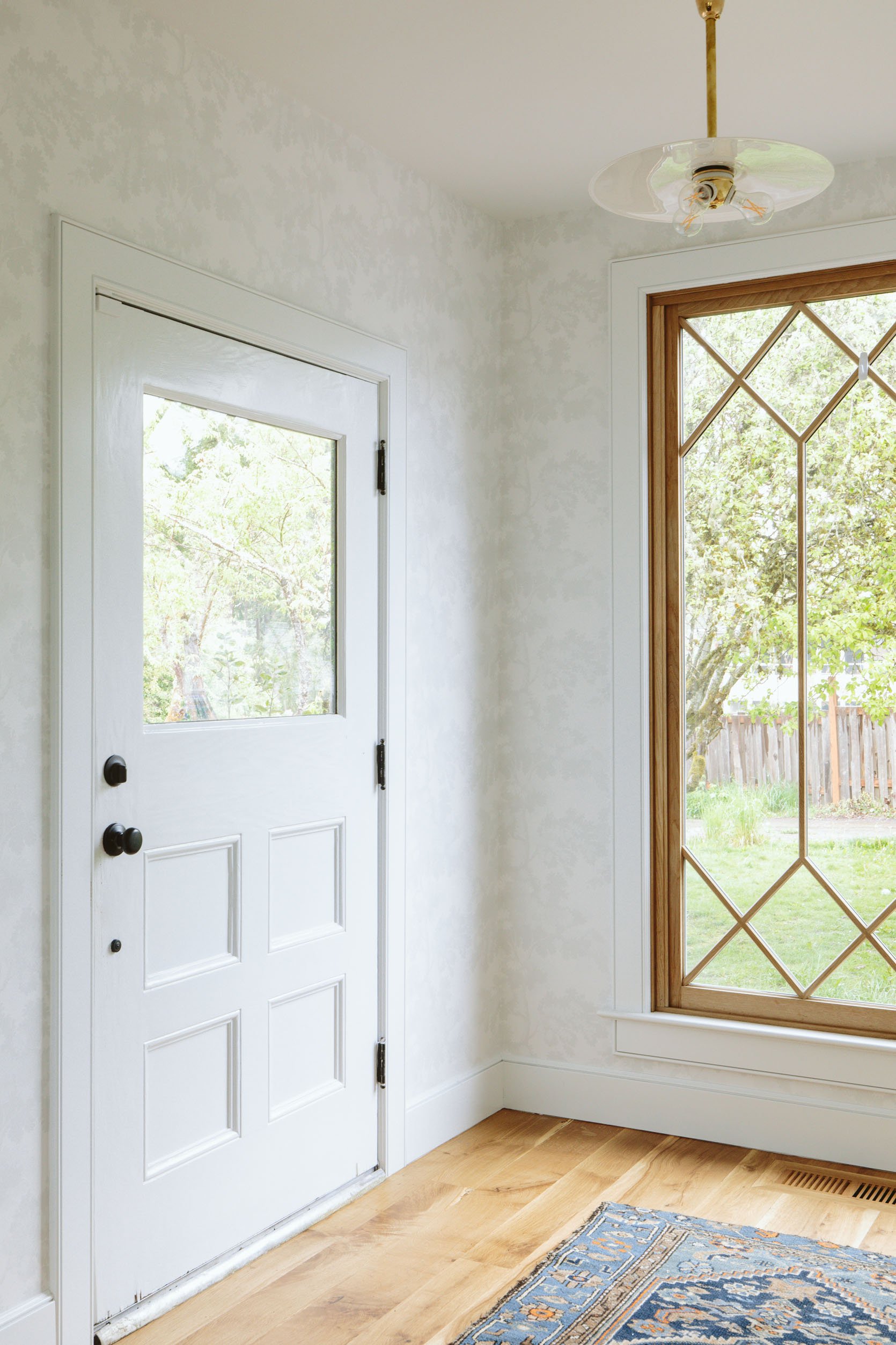
Let’s talk about that bench real quick. It is from Thos Moser and it’s just stunning. I ordered it months ago, awaiting this exact spot. It’s two different kinds of wood – marrying the darker and lighter wood tones we have in the house and the craftsmanship is out of this world. It’s an heirloom piece that we’ll keep forever, by a company that I’ve loved since I was an assistant stylist in New York. Thank you Thos Moser for this beautiful piece that greets our guests. That swoop is just so pretty!!! Also, I may or may not paint the inside of the door 🙂
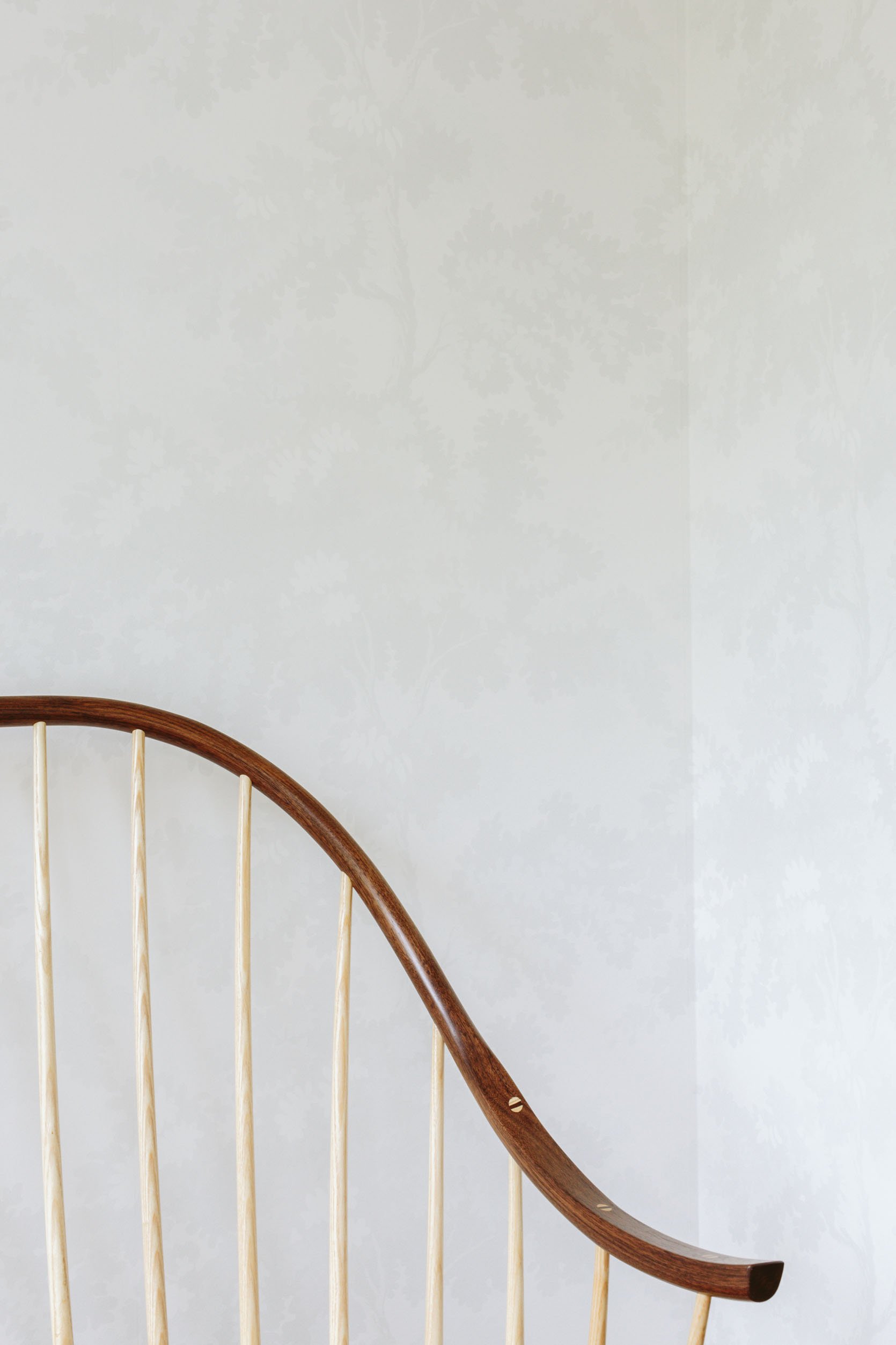
See what I mean??
The Stairway Wallpaper

Blue Wall Color | White Trim Color
That window from Sierra Pacific is just ridiculously beautiful. White oak on the interior, a custom pattern that ARCIFORM helped me design. So many high fives. Also, the blue on the walls (SW 9631 Mantra by Sherwin-Williams) is reading bluer than it does in person (but it does change throughout the day for sure). If you look REALLY, REALLY HARD you’ll see that the stairway is indeed papered in a tiny subtle pattern.
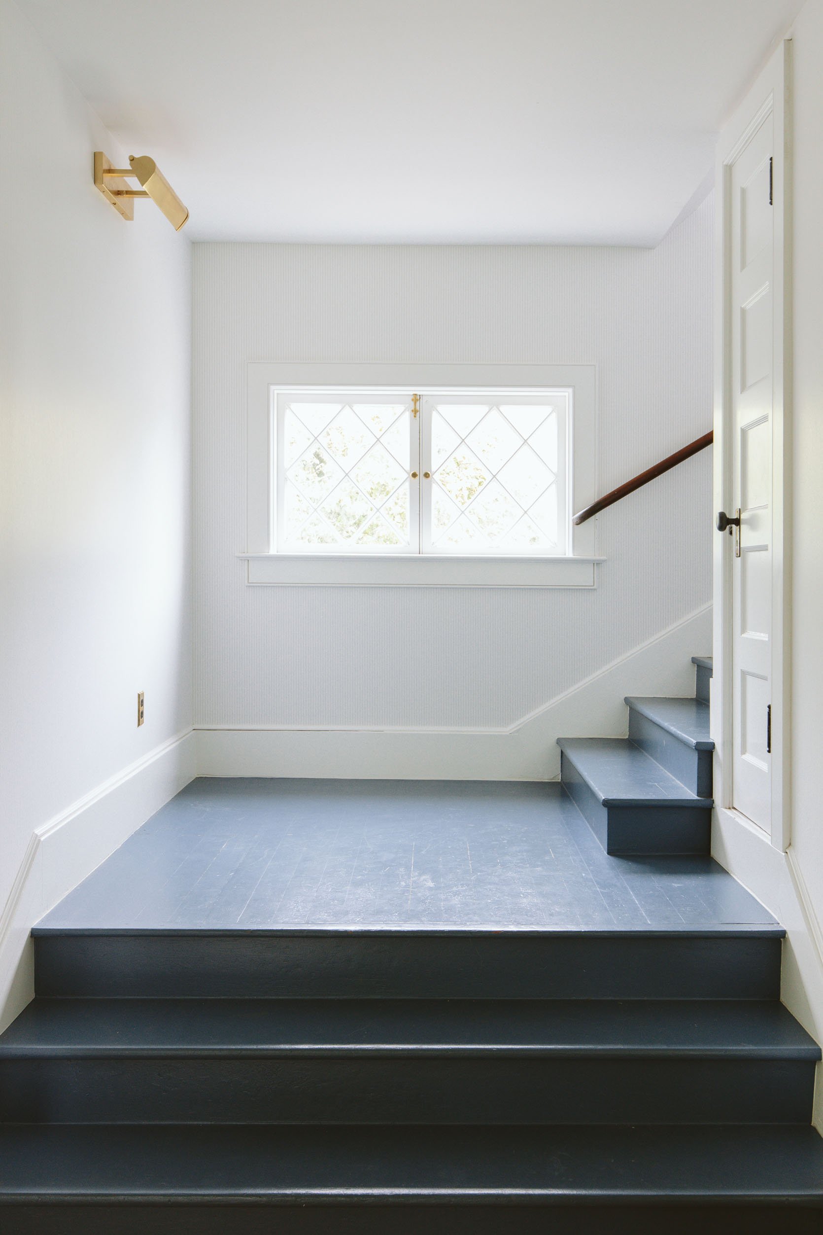
Do you see it here!!??? It’s a very light warm gray/blue and white ticking stripe. I’m ABSOLUTELY obsessed with it and it makes me so happy every time I walk up the stairs. The reason I went so quiet here is that I’m going to be hanging a ton of family photos/personal kids’ art all up the stairway. So I wanted to do something here, but it had to be super quiet in order for it not to look chaotic.
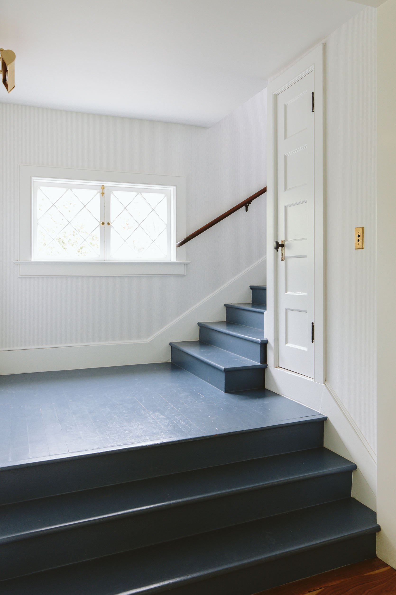

It’s all up on the landing, too (the hallway that enters all the bedrooms) and it looks SO PRETTY. I feel like I’m trying to convince you here (and I must be) and no, it doesn’t necessarily read on camera well (like at all). I guess this shows/proves that I’m designing for me and my experience in this house and less for the camera/photos (which is both good and bad).
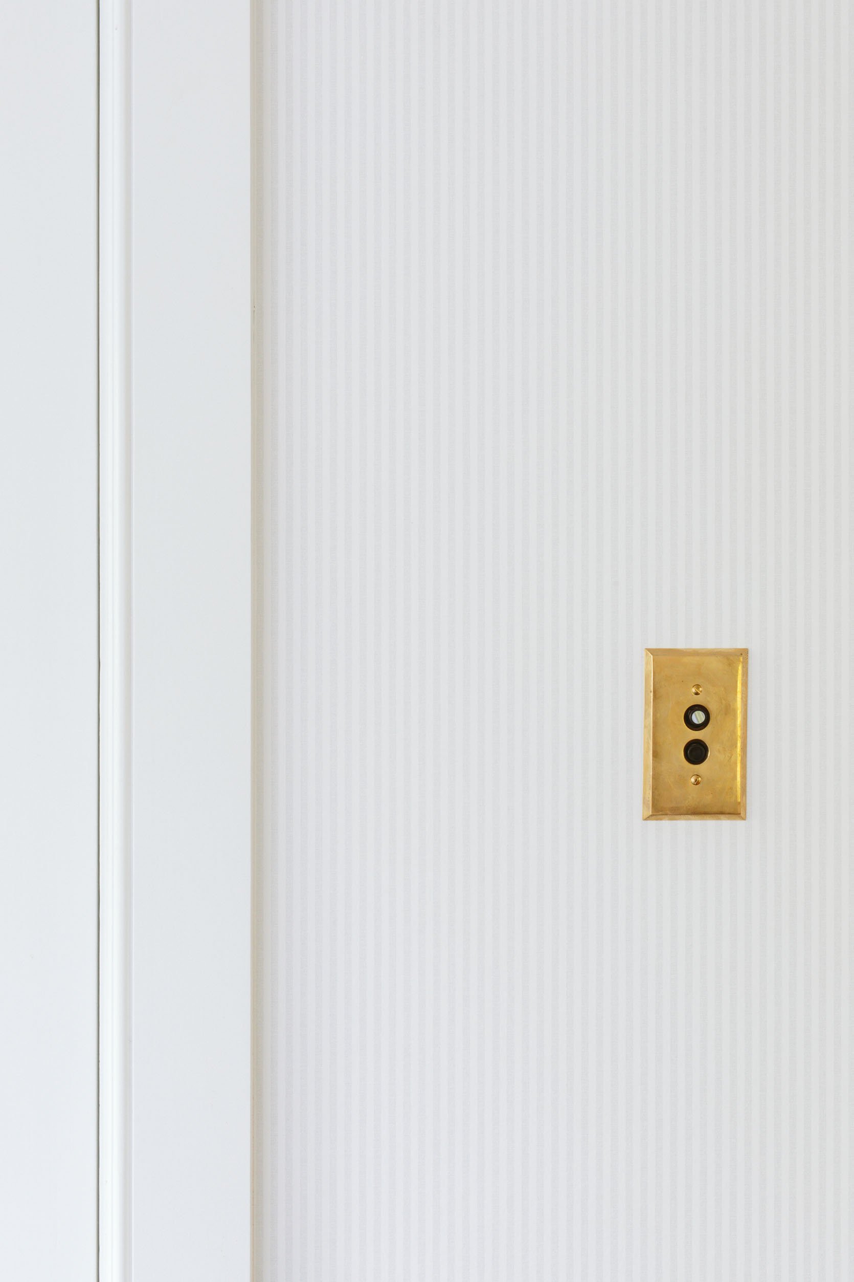
See? There it is 🙂 Here’s my case for it – it’s like limewash or a textured paint treatment. For this house, we didn’t choose a paint texture anywhere but a quiet wallpaper like this does the job of adding texture and interest, without busyness.
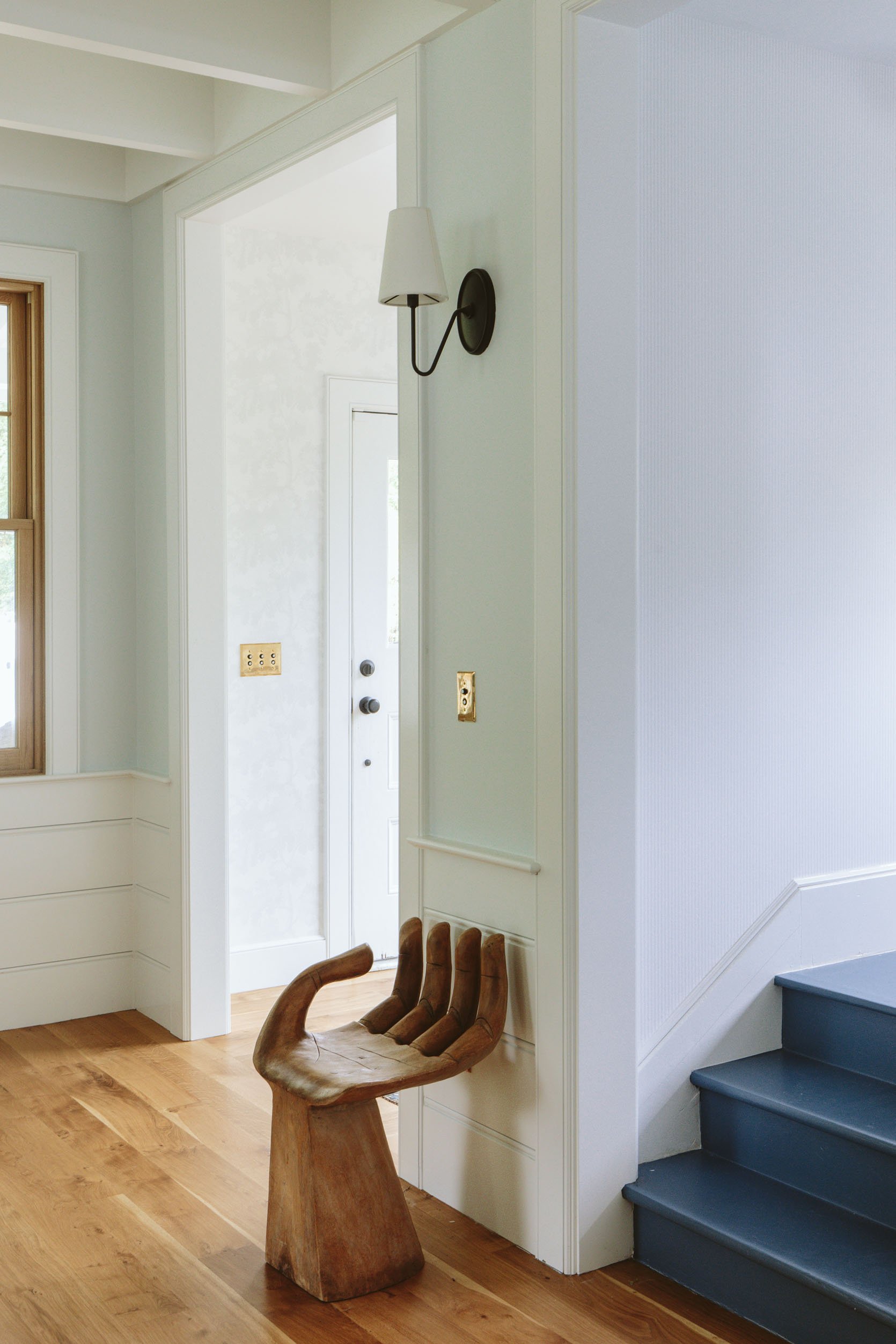
Here you can see both work together and what it looks like from the living room. Both make me so happy and allow me to go a little more nuts on art/rugs. Now the real challenge is how to do a family gallery wall up the stairs without damaging the wall with a million holes… I might, for the first time, try a different technique to ensure that where we hang everything the first time is the right place. Wish me luck 🙂
Resources:
Wood Flooring: Oregon White Oak by Zena Flooring
Windows and Doors: White oak, Aspen Casement by Sierra Pacific Windows
Floral Wallpaper: Scalamandre Raphael Sandberg Wallpaper via Lulu and Georgia
Striped Wallpaper: OSCAR – 6263 by Scandinavian Wallpaper
Stairwell Color: Smoky Blue by Sherwin-Williams
Wall Color: Mantra by Sherwin-Williams
Trim Color: Extra White by Sherwin-Williams
Lighting and Hardware: Rejuvenation
Bench: Thos Moser
*Photos by Kaitlin Green





I *really* like these and the reasoning behind them. And can we talk about the new front door colors?! Stunning and still calm, quiet all at the same time.
thank you thank you 🙂
I agree – the new front door color really is perfect, and I think these wallpaper choices will be wonderful to live with (though they admittedly don’t “pop” in photos).
I think you made the case – these are lovely, particularly the one in the entry.
If you are worried about wrecking the wall paper on the stairwell why not try command strips?
I have and they keep falling off! and then 2 of them actually won’t come off and bubbled the paper. I mean, i could have been the spokesperson for command strips for a decade, but I think they’ve changed their recipe….
I’ve had issues with command strips on wallpaper.
Doesn’t work as well
As on paint
Well, you are right that they are super subtle on our screens!— but I’m sure they are gorgeous in person. The new front door color and entry wallpaper are lovely, leaving the bench and window to be the stars. I love it.
It looks lovely.
Definitely underwhelming, I can’t really see the patterns at all…since the bedroom post last week, can’t stop imaging the wood around the windows without paint on them (in this case, just the entryway window). I suspect the entry may be a space that you will revisit in the future. And we’ll love watching you change it up! And maybe the stairway wallpaper, too. But not the blue stairs!
It would be fun to bet on this stuff – I mean i’ll never say never about anything in life, but if I had to bet I would say that I will never change these papers. Add a ton of art/color? For SURE. But in person they make me so happy…. but keep following and if I do change them I will give you a well deserved ‘ you told me so’ 🙂
I acknowledge that the wallpaper in the entryway is *iconic* and I do love clouds. A “more is more” decorator that I know has a blue and green version of this wallpaper in his bedroom.
Since I have been following your blog for 10 years, I am sure I will be around to read about it if you ever decide to change the space and share the process. I am not rooting for you to grow tired of your choices but the blog needs content so one can dream…I suppose I should be appreciative of the fact that you have opted not to design for the ‘gram but for yourself and your loved ones.
Thank you for commenting even though this was not an “rave review” type comment. If I am not offering an opinion, I often don’t feel like I am not truly engaging with something, so please take my remarks as a sign of my admiration and respect for what you do!
Probably non-starters but for the next iterations…a William Morris print for the entry and the vintage plaid collection fabric on the stairwell walls??? Just a hint of joyful maximalism in the calming and peaceful living room!
Awww…you don’t need to defend your choices! This is your house, and yes of course you are using it for content BUT at the end of the day…it needs to speak to YOU and work for your family.
As a designer myself I LOVE color and bold pattern, but cannot live with it at this time in my life. It’s overwhelming when you add in the (ugly) colorful kids toys, the cats chasing each other and the general noise and clutter of life with kids. Plus after working with pattern and color all day I just want a visual break at home.
These wallpaper choices are subtly beautiful and set a calm tone!
Emily, you nailed it! (without leaving any little unnecessary holes I might add. 😬). You’re right, the wallpaper in both areas is calm and beautiful. Well done – I love it!
This is like one of those I Spy books, except it’s I Spy the Wallpaper. Lol. I really love the ticking paper in the stairwell. Perfect choice of that space and for this modern farmhouse. I think I like the entry wallpaper too, but I’ll be honest, I have a very hard time seeing it clearly in these photos, and I can’t quite tell the pattern. It does look a bit like you could stand in the room and feel surrounded by clouds (I think they’re leaves?). Very pretty.
And blue front door!! Awesome color!
its so hard to see!!!! I LOVE IT and over the weekend started playing with a gallery wall in there (very colorful) and i’m so excited. No nails though, and y’all command strips do NOT work how they used to. So I think i’m going to do a gallery rail …
I’ve seconded LouAnn’s comments before and I’m doing it again!
Love this bench: it’s even prettier in situ.
I was thinking about a gallery rail..both for this room, and for the old house I’m moving into with redwood walls (It already has holes from previous hanging but I like to move art around and so a rail will be more flexible.).
Looking forward to seeing it finished!!
I switched from nails to command strips for all my wall art in 2020 and they have worked great. I double up for bigger paintings. Not sure what’s up with yours, but I swab the wall with alcohol (it’s paint) and place the strip, wait and hour, and it works every time.
Subtle but beautiful and timeless! Excellent!
Gorgeous, Emily! Subtle but perfect. Have you considered covering the stairs with that beautiful blue carpet you used in the kids’ room in the mountain house? It would add softness and texture and complement the walls beautifully. Bravo and can’t wait to see what’s next!
In a previous post she noted they have already selected a runner that is on order/in production.
Yep! I lOVE that carpet. But we have one that we are picking up today (installing next monday) so stay tuned on that 🙂
I’m a fan for finding places for the eye to rest and bringing in stimuli in other forms (pillows, accessories, etc.) I love them both but especially the foyer!! Can’t wait to see the gallery wall.
Subtlety is an art and perhaps an underpracticed one these days. Not every design element has to be “in your face.”
That floral is perfect for your entry hall and complements the window, which is definitely a star, beautifully. Great decision!
thank you 🙂
Both wallpapers are very pretty! I think painting the inside of the door would be great; right now, the room looks a bit lopsided to me.
I hung a gallery wall with command strips. Much easier to do–and undo–and they are still going strong 7 years later!
Ok heres the deal – the OG command strips held SO MUCH BETTER. these new ones don’t!!! I might get the heavy duty ones for the gallery wall up the stairs (because I can’t do a gallery rail there). but even in the middle of last night one came crashing down (no glass and it was super light so no damage). I just don’t trust them anymore!
Have you tried the command strips with the velcro? I recently installed a gallery wall and a (separate) plate wall at my sister’s house and those things worked amazingly!!
Totally support the plan to paint the inside of the front door with the new blue color!!!
I have to politely dissent: the wallpapers are so classy, and I like the hallway pattern in particular, but I was so in love with some of the bold swatches you presented as entry options a while back. I was really looking forward to seeing something exciting and cheery for the entry. I’m so glad the calming effect works for you and is what you need! The door colour is great! But again, I can’t help it. I love a floral paper. Excited to see what you hang in the entry and how the styling goes!
don’t worry!! so much colorful art is happening in there. I promise 😉
Brewster Spinney toile https://www.brewsterwallcovering.com/3115-12541-spinney-grey-toile-wallpaper/3115-12541 in grey, but now I think I’ll also sample the Sandberg in white. I had been looking at in in grey, but it was still too much for me. Thanks for the inspiration and confirmation of the direction I seem to be heading in.
Ah, it seems like the first half of my message was lost. In short, it said “Brava, Emily! Your choices are absolutely perfect! I would love to walk into that space. We seem to be on the same page as I was considering the Brewster wallpaper above.
Absolute perfection. The bench and window are showstoppers so it’s the perfect amount of texture behind while still letting those two shine!
Totally unexpected! (I imagined a bold floral). That’s why I love these update posts because you always surprise. The combo of paper, wood trim, the BENCH!, and lighting fixture is…perfection! Yay!
As someone with 85 swatches of wallpaper – from fun and busy to quiet and neutral – hanging up all over our hallway, I FEEL YOU. A vintage farmhouse screams “color and pattern” to me, but I don’t have enough confidence to take a chance on what is now very expensive (WOW have prices gone up since the 80s when it was popular) a crazy wallpaper. The quiet wallpaper in the entry makes the bench shine and is a good reminder that design is part of a whole, not just individual choices. Thank you for the timely post!
Love, love, love both papers. They are so pretty and calm plus they let the color on the stairs and that insane bench shine!
Ok, so I actually love these! Not underwhelming me at all.
I have no doubt these are gorgeous and perfect in person, but have to agree with other posters that they are invisible on screen. Wish I could see/appreciate them, but good for you for choosing what works best in real life.
I know. so hard to see 🙂 i’ll do some stories today so you can get a sense of how they feel in person.
Ooooh, the bench!!
It is a tad underwhelming, but I like the ticking stripe on the stairway. Subtle and elegant.
The paper in the entry is too hard to discern and reminds me of the 90s trend of sponging on walls., kinsa?
I think the gallery wall of family photos is going to enliven the stairway wonderfully.
Painting the door would bring some vigour into the entry.
Delightful! Love it! Zero convincing needed!
First, I LOVE the wallpaper in the vestibule. Especially with that rug! Dreamy. Second, this post was very instructive – in a good way! I tend to go for ‘lots of loud pattern’ and then back myself into a corner when it comes to art or rugs. I would never have considered a subtle wallpaper and now I get it! And you’re right – we’re conditioned by editorial photos in magazines and blogs to go for things that are photogenic but not necessarily amenable to bringing calm to every day living. Marrying the three areas together with the light blue gives you so much room to play but goes beyond white walls. It’s coming along Emily! Thank you for sharing!
I’m convinced! Thanks for walking us through your decision process. And please do a post on your process for the gallery wall. We’re all in to the fewer nail holes the better.
I am huge fan of what you do Emily and maybe these read better in person but it’s really hard to see the design or impact of the wallpaper in these photos.
I love how you have used wallpaper in the Portland House; the Rebecca Atwood one you chose in the dining room was calm, subtle but still very impactful. I also loved the Glendale house wallpaper choices including Charlie’s nursery which also read very calm yet interesting.
Obviously your personal tastes evolve too and this is your home but I personally think the mud room was probably an opportunity to go bolder; even a different color way of the same wallpaper.
Such an interesting post. I love the papers and wish I could see them in person, may even look them up.
What a beautiful canvas you’ve created.
I agree that going subtle can be a beautiful way to use a pattern you love, but want to keep things versatile, especially for visually connecting spaces! For my Vermont Cape-style farmhouse (think rolling hills, quaint villages, lots of cows), I have a semi-open concept on the main floor: the bright eat-in kitchen on one half of the house connects via a 48″ open arched pass through to the cozier, darker painted sitting room/dining room. Unfortunately, the two spaces are linked by one wall that spans the whole front of the house. I know accent walls are considered a bit dated, but there really is no other way to treat these spaces separately without also making this wall a feature. I found a perfect solution in a fairly large-scale patterned wallpaper that mimics our area – Mini Moderns Moordale in Stone. I had the lighter warm gray color-matched to paint the walls in the kitchen, and the sitting/dining room is currently Farrow & Ball’s Calke Green, but soon to become Oval Room Blue. I loved the other colorways in this wallpaper, but they would have locked me into a color scheme for the whole main floor that I’m not ready… Read more »
OMG, I would love to see your house!! Do you have an Instagram?? My office and entry are both Calke Green and we JUST painted our living room Oval Room Blue and love it!!
I LOVE that paper. considered it myself!
Thank you for sharing your thought process! It is your home after all, so what’s most important is that you are happy with the final choices. I agree with the other comments that it’s very hard to see these in photos, my guess is that the in-person experience is very different than how it photographs. At first I thought the entry way was sponge painting, and if I’m honest I yearn for a bit more definition/interest in the wallpaper, without it being hugely distracting from the window and the beautiful bench. I know that this pattern has other color ways, I’m so curious if you considered any of those? Emily, I would specifically love to hear your thoughts on the color undertones happening in the first floor. There are many different blues with lots of different undertones (maybe this is just in the photographs as well?) – so I’m wondering if you had an overall plan for the colors. I think it’s so helpful for your readers to understand your thought process. I did want to say that the front door looks so much more cohesive with the rest of the house now that it’s blue/grey instead of the bright red!… Read more »
I’m really learning as I go so I will NOT be doing a master class on undertones anytime soon 🙂 its looking really good though! Finally 🙂
I really like this comment in both tone and substance! I’m happy you brought up the undertone thing, too, as I’ve been wondering about it throughout this process.
As always getting a detailed glimpse into your process is both educational and entertaining. I can totally understand all your points here though I do personally feel differently. I find that a calm space as you seem to be manifesting it (very neutral and low contrast and soft) feels kind of blank to me, and in practice, with the realities of my life currently (very active three year old and her friends and not the tidiest spouse) that a more colorful home feels better both when it’s clean and when it’s messy (inevitably)! The general clutter of life sort of blends in with the surroundings of my home, colorful kids toys don’t look as out of place and it all feels happy and lived in but not too chaotic. Personally if I lived in a home like your (beautiful) farmhouse, I would feel the need to clean constantly because it just looks like anything ‘mess’ would be out of place and stand out. Of course I very much understand your job and life is so different from mine and I can imagine how this level of calm interior feels better to you and that’s great. I would be very curious… Read more »
OOH thats such an interesting perspective! And different than mine, but I totally get it all the same. I do feel the need to clean, but I did when I lived in a much busier house, too. likely because the kid clutter is just so annoying to look at (why did they refuse to play with my pretty scandinavian blocks!). I also spend all day every day here so that might be different. anyway, i like your perspective and could totally see that being another way to go that works better for people.
I wish my cat would appreciate my pretty Scandinavian toys and cat towers! Have you seen Werner Herzog’s sad beige toys? https://www.tiktok.com/@sadbeige/video/7170480891620347182
Yes! I’m sure that being home all day and your home being your work changes things vastly. Also I think it was Ingrid Fetell Lees or someone commenting on her instagram stories about everyday life/kid mess as ‘evidence of joy’ instead of just a problem to be cleaned up and that has been a big perspective shift for me (as an obsessive perfectionist Virgo who has a wild joyful expressive explosion in a three year olds body!) that’s helped a lot. In general her work about home and the feelings that are brought up by different design for different people has been very interesting and some stuff similar to what you are talking about here regarding the feeling you are seeking in your home (warm calm etc).
I love it Emily! It’s timeless and very versatile. Sure, it’s not a punch to the face with pattern, but it has longer staying power. I think people believe that designers should always be the most dramatic with decisions, but we have to remember that, like all of us, they want a home too. Everything doesn’t have to be a trendy showplace.
I am surprised by how much I love both wallpapers! I admit I when I first saw it my reaction was disappointment, but considering the longevity of both choices and the way you’ve designed the spaces (that bench is so simple yet stunningly beautiful!), I actually love the way both areas are coming together! Looking at all three spaces (entry, living, and stairs), I find the light blue in the living space photographing very green, the coolness in the color unfavorably contrasting with the grays/blues in the other rooms. Curious if it reads the same in-person or if its just on camera?
It rarely looks like it did in that photo, for sure. its so pale its honestly hard to see but in that photo it looks so robins egg. I actually wish I had done the entire living room in the ticking stripe. I love it so much. trying to convince myself that doing it in the living room AND the stairs/landing won’t be too redundant…. thoughts?
Love the idea of bringing the ticking stripe into the living room! Especially because it would solve the problem of having lots of different undertones (darn you, paint! LOL)! I love the idea of some visual continuity too!
I originally thought wallpaper in the living room but I really like the blue paint (it leans warm blue to my eyes) that’s there now. When both curtains and art have been added in the living room, it will be great. I find the ticking stripe wallpaper awfully cool (unlike the new entryway wallpaper which reads warm in the photos) so I’d resist the urge to add more cool elements to the living room. It needs warming up more, to compliment the other permanent finishes and furnishings.
Yes, I agree with this. I think it might be a shame to replace the warm blue paint with the ticking stripe wallpaper in the living room – although I liked the idea elsewhere to bring in a ticking stripe in the LR with the curtains (and/or cushions/furnishings). Continuity without sacrificing what already works!
I’d think carefully about the vertical stripe on top of the horizontal planking in your living room wrt using the ticking stripe in that area. There are already a lot of lines and small things in the space. If you want to paper the LR, maybe consider a grass cloth. But I’d do drapes and furnishings and fireplace sorted first, then assess.
I love visually stunning, but I don’t want to be stunned in my home. I want a warm, comfy, calm refuge and oasis for my family. These are gorgeous and soothing and bring pleasure to the eye. Love!
I love both wallpapers and think they provide a neutral but interesting backdrop to whatever accessories you rotate into the spaces as you see fit. Second, I think some of the pushback on the wallpapers being “underwhelming” is that Emily chose to decorate for “real life” and not camera. Often for the blog, Emily and Team are thinking about camera angles, the money shot, and editorial images since that is what folks want to see, crave and performs I am sure. In this case, she decorated for the day-to-day living that will occur in these spaces. Both are viable options but Emily and Team have trained us to expect the big, bold and impactful from her that when we do see something that whispers rather than shouts on camera, we may feel not as excited. Kudos to you Emily on the selections and cant wait to see the final shots in the magazine when it publishes!
ah thank you. And yes I used to always design for the shot (in addition to what I liked) and i know this won’t perform as well (for SURE). But i’m so happy. its finally coming together and I think a video tour will help everyone understand what is near what and I think that will give a lot of insight.
Love the subtlety! A calm and quiet sanctuary is the best. With endless wallpaper options out there, it would be fun to see a roundup of the ones you didn’t choose but that were contenders.
I can very faintly see the wallpaper in the entry on my screen but it sort of reads like the sponge painting that was so popular in the 90’s, just with the color gray? I can’t really see the one on the stairs at all on my screen. It just reads as white to me. That’s okay though.
I’m sure they’re amazing in person and I absolutely understand the desire to have your home feel calm and classic. I’m hoping when the magazine layout comes out that we’ll be able to see the wallpaper better in those photos.
love the subtlety. Beautiful, and I love the pale paint in the LV too. I think that soft blue green gray is gorgeous and subtle and pleasing to the eye- I worry about folks getting so caught up in the color way process, don’t change the paint! Soft and watery!
This is your home, and you get to decide! They do not come through in photos very well at all I suspect, but if they make your heart sing then thats all that matters. This is a project for you, not for magazines, not for clout, not for the wow factor, and sometimes we just want calm. I get it!
They are beautiful, both. It takes confidence to be subtle. Is there a rug that can better tie the bench and wallpaper together?
They’re perfect! I’m glad I clicked on the source page because I couldn’t really tell that the entry wallpaper pattern is leafy trees–it’s a perfect, gorgeous pattern for this entryway–*chef’s kiss*. And the subtle stripe up the stairs is the perfect complement. Congrats & way to go all around!
my thoughts in real time:
“mmmhhmmmm…”
“gah! entryway is simply stunning!”
“ahhhh -wallpaper choices in these spaces could not be more perfect.”
“sublime…”
“Oh my! I looove how these two spaces connect with each other!”
etc and so on ; ) because… I mean… just, WOW!
thoughts on the ‘trying to convince us’ piece:
I took a Writer’s Workshop once where one rule reigned:
When reading your work aloud, you were not allowed to begin by forecasting your doubts or diminishing the work in any way. It was a shockingly difficult rule to follow but it was also illuminating (perhaps even transformative..?).
I find these spaces to be carefully considered, quiet yet emotionally impactful but also, exceptionally lovely (IMHO : ) distillations of the Emily Henderson signature design perspective but I was also a tiny bit distracted by the introduction that attempted to temper my expectations and wondered how I would have felt without it..?
More vitally, these are truly gorgeous spaces Em and I am so glad you are designing for YOU : )
OH thats so interesting re the writing note! Maybe i’ll try it (but y’all, i love a disclaimer so much!!!). I think I just like to get ahead of the feedback/criticism. Obviously a defense mechanism. Anyway, thank you so much for your real time reactions. They made me VERY happy 🙂
I love these! I kind of feel like a picture rail might be helpful for that art hanging? I feel like you WILL want to move art in the future, so might as well plan for it? 🙂
It makes total sense to use calm wallpapers for all the reasons you listed. I also think that your entry and stairs are better as a lovely background to the stunning living room you are creating. If entry and stairway scream pattern then they would sort of look like big paintings in your living room and you’d need your living room to be even bolder or have other large things that balance the “rooms beyond”. Unfortunately it’s one of the things that might not show easily on pictures especially since most of us view this on our phones. But that’s okay, closeups show how beautiful those wallpapers truly are. This may also be easier to see on video. Anyway, I like it. I bet it feels good when decisions are made and there’s one less thing to think about.
It’s just that in these neutral spaces like the living room, it seems like a lost opportunity in these smaller spaces not to bring out the paper that really pops like in the Glendale laundry closet, the Portland flip, and some of the bathrooms and powder rooms. But maybe that way of thinking is passe, soooo 2020…not sure…
I love neutral wallpapers! I love the subtlety as well as the character it adds to a place. I find it much easier to decorate and have more statement pieces around the house as well!
They may have not been my first choice, but it reflects who you are and the space. Also, I don’t live there! 🙂
Bravo!
I’ve been following for a long-time and have always been a big fan. My oldest is also a few weeks younger than Birdie so I really feel the evolution of your home and style reflected in my own parenthood/design journey and I gotta say, the farmhouse is quickly becoming my very favorite of your projects. I LOVED the Tutor also and thought it would be hard to top but I was wrong. Your home feels like a hug from your coolest aunt who is always ahead of the times but never loud. Classic, cool, and always the one you want to call when you need advice that will last you for the long-haul.
Love the whispers of these wallpapers that invite one to lean in….they provide calmness, interest, texture.
To hang pictures on a wallpapered wall, I suggest using a razor blade or very sharp craft knife to cut 2 sides of a wide triangle on the wallpaper, with the point at the top. Carefully unstick the tab you’ve created and let the wallpaper lift away from the wall. Don’t crease it. (To unstick wallpaper, use damp rag to loosen the adhesive) Put a nail into the wall close to the top of the blank space created by the tab of wallpaper, keeping the wallpaper tab free. Carefully hang your art. If you want to move the art, carefully remove the nail. Using slightly diluted wallpaper paste, re-attach that wallpaper tab to the wall. Usually the cuts are almost invisible on the repaired wall.
/ . \ <—– nail here, on the wall, under the wallpaper tab
/ \ <– cut two sides of the triangle with a very sharp new razor
/ \
– – – – <—-carefully let wallpaper bend toward you here, so you can see the bare wall behind the wallpaper tab
WOW!!! That’s an amazing hack!
That is genius!!
Gosh, they are two dreamy wallpaper choices (that I can see clearly on my monitor). They pack a very subtle but elegant punch. To answer your question to Chris – yes, wallpaper the living room! 110% I would paper that room. Can you imagine the subtle movement of that stripe, the cosiness it will bring to the space…I can. Gorgeous!
I love them! Even though they are hard to photograph for sure, I can easily imagine how they feel in the space. To me, they’re a MUCH better incarnation of the shaker aesthetic than the bolder wallpapers. Not that you have to or need to stay wedded to that inspiration, but nevertheless these choices speak to it. My personal preference for the farmhouse leans more toward that shaker direction , less of the eclectic, charming, grandmother chic (though of course both are totally valid interpretations of a farmhouse).
Like other readers noted, the door color is gorgeous. But I’m not sold on the color of the stairs. Excited to see my perspective shifts with the addition of the runner.